Typography
The NEOMED brand has typography standards for print and web.
For Print
Optima
Optima must be used for headings.
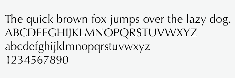
All styles of Optima:
- Regular
- Italic
- Bold
Gill Sans
Gill Sans primary use is for subheadings or any other navigational callouts.
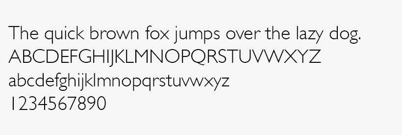
All Styles of Gill Sans:
- Light
- Light Italic
- Regular
- Italic
- Semibold
- Semibold Italic
- Bold
- Bold Italic
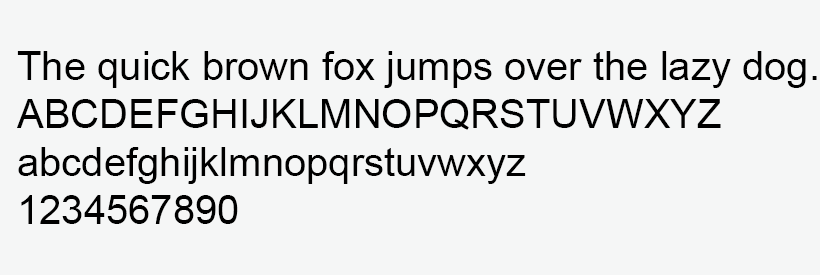
Arial
Arial is used on all body copy.
If Optima or Gill Sans is not available, substitute fonts for Arial and Arial Bold. Arial Italic and Gill Sans Italic may also be used to enhance a message.
All Styles of Arial:
- Regular
- Italic
- Bold
- Bold Italic
- Arial Narrow Regular
- Arial Narrow Bold
- Arial Black Regular
Calibri
Calibri, the default font in Microsoft Office applications, is acceptable in Word documents, PowerPoint presentations and Outlook email correspondences.
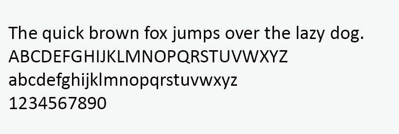
All Styles of Calibri:
- Light
- Light Italic
- Regular
- Italic
- Bold
- Bold Italic
Garamond
To ease readability, Garamond may be used for large fields of body copy in print publications.
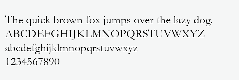
All Styles of Garamond:
- Regular
- Italic
- Bold
CONTACT
Office of Marketing and Communications
Phone: 330.325.6618
Email: marcom@neomed.edu
MEDIA
Roderick Ingram Sr.
Chief Marketing Officer, Strategic Marketing and Communications
Phone: 330.325.6673
Email: ringram@neomed.edu
